Scottish Attachment in Action.
Scottish Attachment in Action are a passionate and committed group of people determined to raise awareness of attachment theory and its implications for policy, practice, families, and communities. They met for the first time in 2006 and became a national registered charity in 2015 with a Board of Trustees consisting of practitioners, parents and carers that represent our mission that ‘Attachment Matters for All.’ Today, Scottish Attachment in Action continues to provide information, resources, training, and research in attachment across the lifespan and society.
Project Launched: MAY 2022
Branding your business
Colour Palette.
We provided SAIA a variety of colour palettes which we felt suited their new brand direction and fit well with the company values, from these examples we then narrowed it down to 3 main colours and 2 standard black & white tones. These colours were then wrapped around our website concepts to provide examples in a real world scenario and also demonstrate how these can be applied to illustrations on the site to maintain a uniform look throughout. As always we provide detailed information to our clients on how to effectively use these colour schemes in our branding guides.
PRIMARY COLOUR
HTML: #AF8FE3
CMYK: 34% 46% 0% 0%
RGB: 263/37/89
PRIMARY COLOUR
HTML: #053067
CMYK: 100% 89% 32% 22%
RGB: 5/48/103
SECONDARY COLOUR
HTML: #A4DBD6
CMYK: 24% 0% 18% 0%
RGB: 164/219/214
BACKGROUND TONE
HTML: #FFFFFF
CMYK: 0% 0% 0% 0%
RGB: 255/255/255
BACKGROUND TONE
HTML: #181818
CMYK: 73% 67% 65% 79%
RGB: 24/24/24
attributes and credentials
Digital Identity.
Scottish Attachment in Action approached Made in Scotland to discuss the development of a fresh new website and digital identity package that reflects the organisation’s values while remaining accessible to everyone. SAIA has a large archive of useful resources which they wanted to make more accessible to everyone online. In order to facilitate this, we created a user-friendly database allowing the SAIA team to update their own resources and manage online content in an easy-to-use environment. This is a common request we get when discussing any new website project with clients as more and more businesses are choosing to store their files online to create a paper-free environment and allow easy access to documents for all team members.
Future Goals
Project Planing.
From start to finish any project we undertake is professionally managed through a custom project plan created to outline each step in the development process of your website and we arrange routinely scheduled virtual meetings throughout to capture feedback on crucial steps of design and development. Client feedback is essential in creating a finished product that is fit for purpose but also remains easily accessible to the client and their users, our goal in any project build is to use our digital knowledge and talents to help your organisation achieve a higher success rate online and build a loyal following of customers across all platforms. At the end of each project, we evaluate our process internally to continually improve our service offering and quality of work.
BRANDING AND IDENTITY
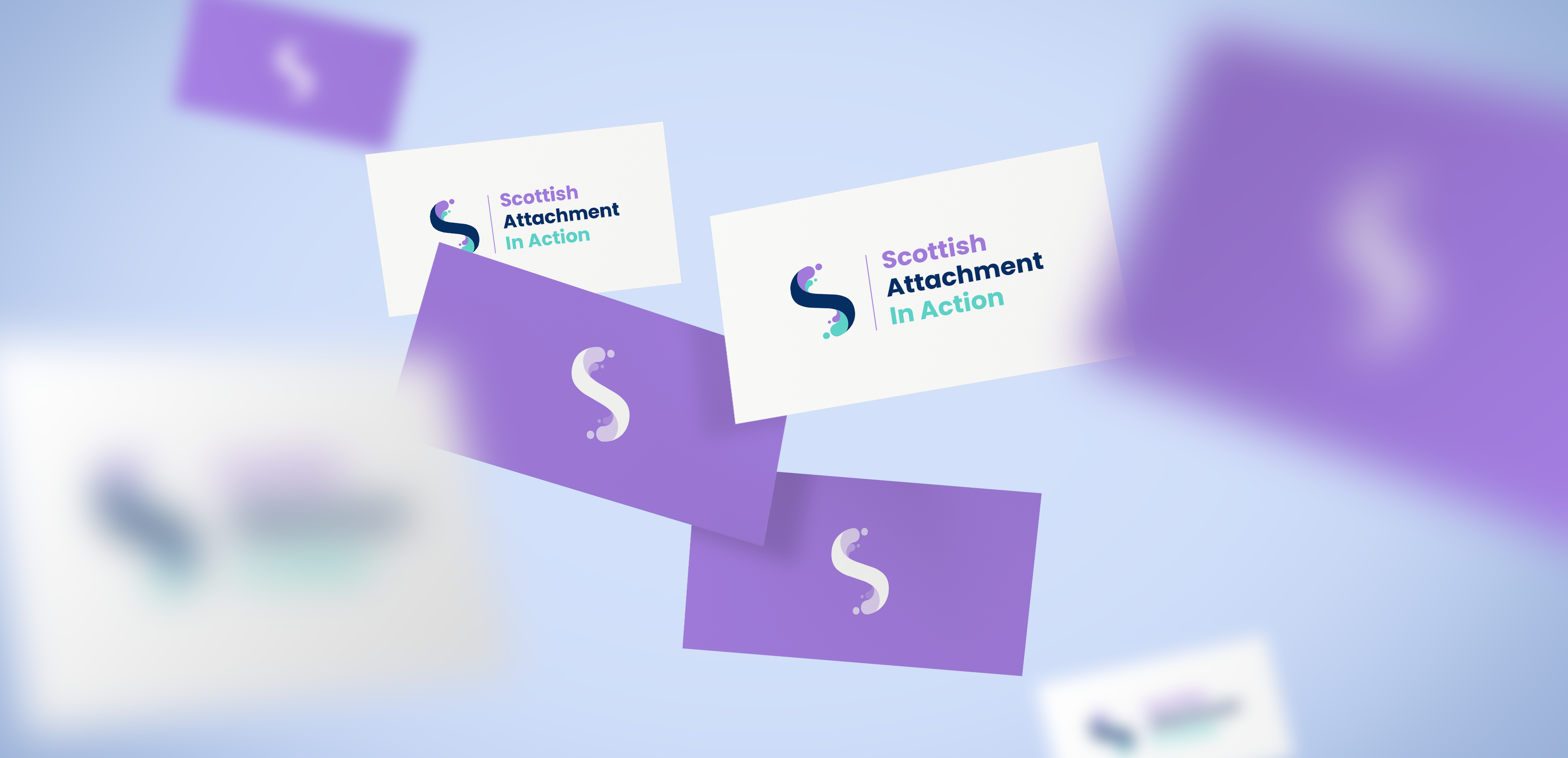
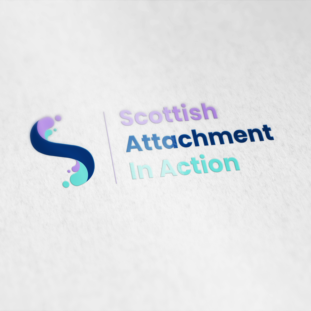
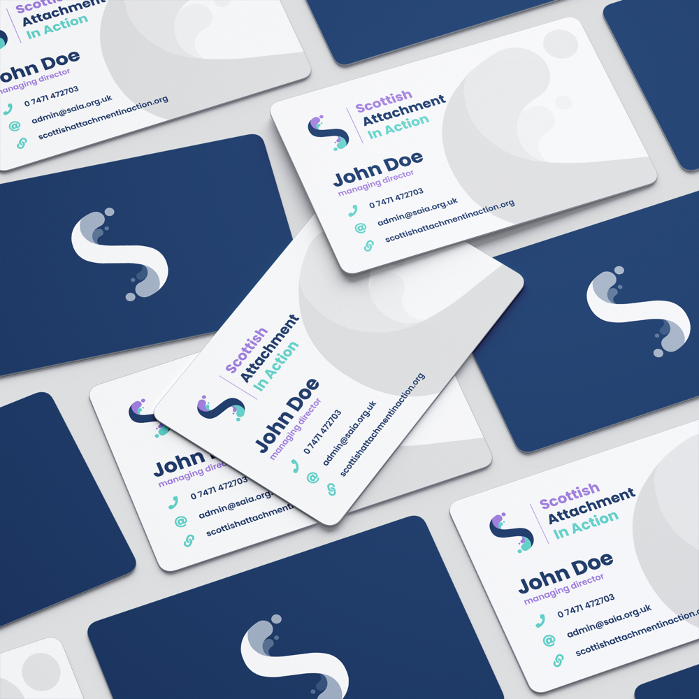
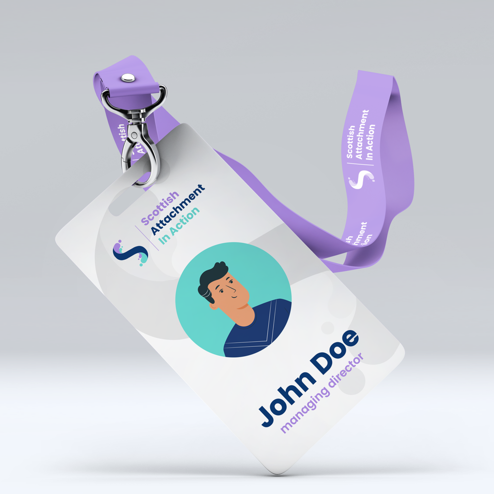
Logo Design.
When designing a new logo & branding for any client we take careful time to research the organisation thoroughly to create a unique and recognisable logo mark with a colour scheme that compliments the company values and target audience. When working with Scottish Attachment In Action we provided a number of logo concepts with various fonts and colour examples allowing the client to share these designs with their team to give us all important feedback and direction. Once the logo has been decided we can start to build a brand identity aligning colour, typography, design elements and alternative logos for social and print media.
With any logo design we firstly do a bit of research around the subject before diving in to the sketchbook and creating concepts. We provided the client with a number of different logo mockups based on initial discussions and the values of the organisation. Each logo was presented seperately with a supporting icon/logo mark which was then presented internally within the organisation to gain a wide variety of feedback from all SAIA’S board members. The majority of the feedback received had favoured one logo in particular which we further developed and refined into a unique logo mark for the organisation which encopasses their modern approach to helping and educating others.
SAIA - Final Logo DesigN
Professional design and development
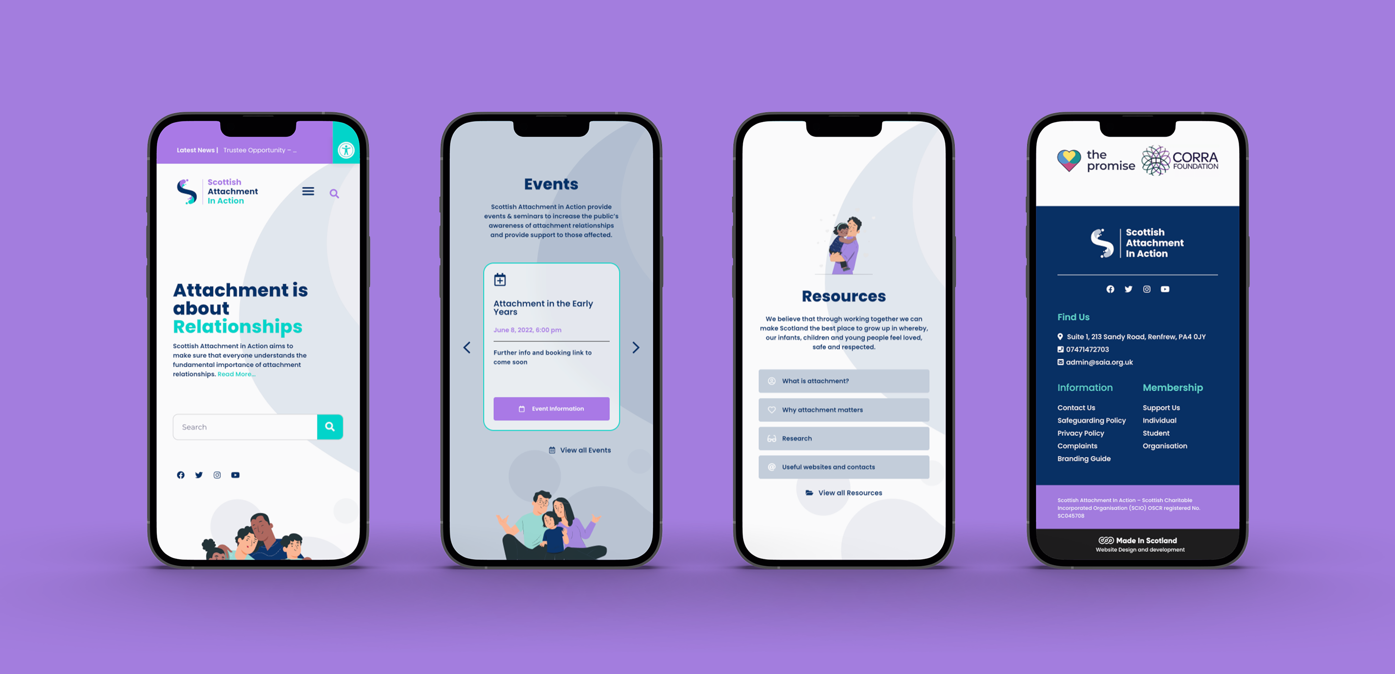
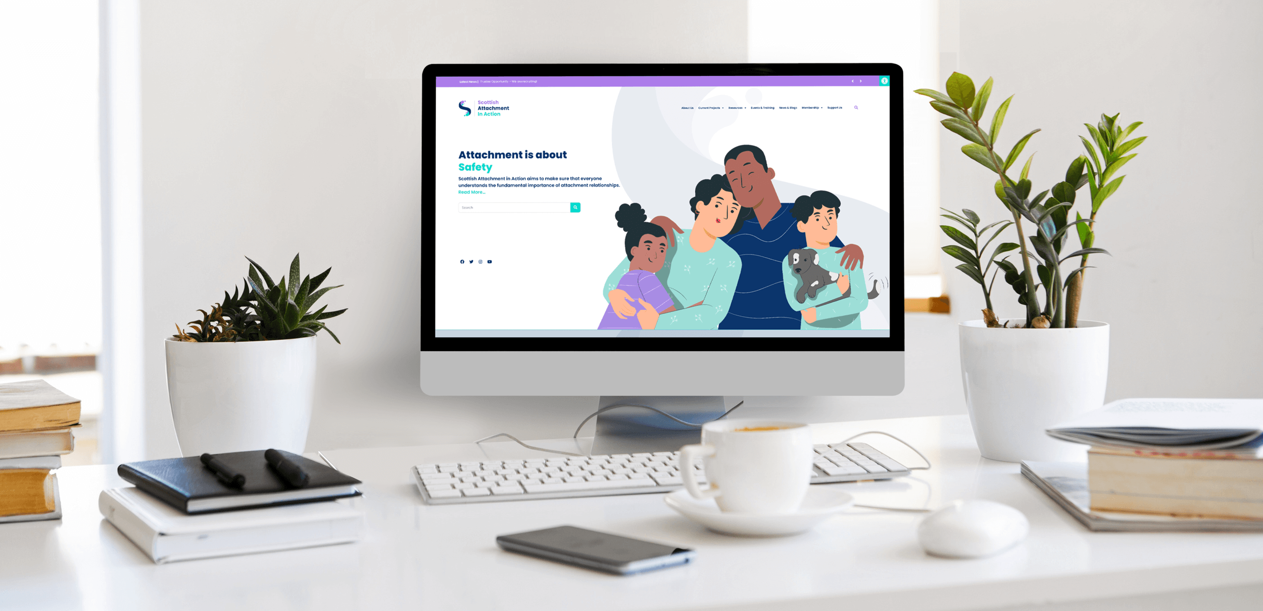
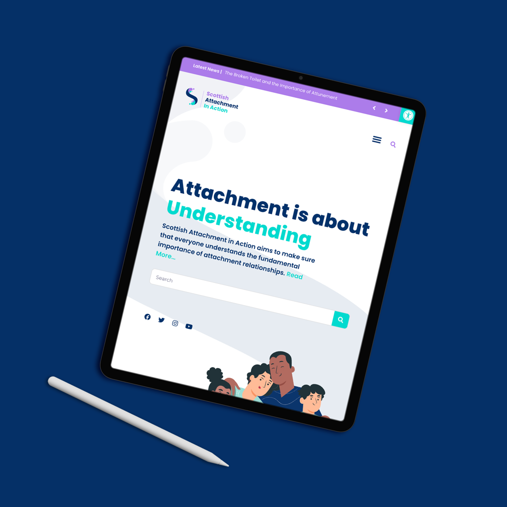
Website Design.
Communication is a big part of our development process, as such we arranged fornightly virtual meetings to provide progress reports to the client and gather all important feedback on specific areas of design, illustration, iconography and content. We went through a discovery process to decide with the client which illustrations would be most suitable to convey their message, and decided upon a flat more family friendly style which uses the brand colour scheme rather than heavier 3D rendered images.
Client Gains
Project Outcomes.
Since the new Scottish Attachment in Action website went live they have seen a vast increase in user traffic and customer newsletter sign ups and engagement. This has helped boost the amount of users and organisations that subscribe to the clients monthly/annual memberships. We continue to work with SAIA and are hard at work currently developing an interactive E-learning platform that will be used to share their wealth of knowledge around attachment relationships and other topics.
Our team love to work on projects that help others in need using our design talents to increase interest in organisations that educate others on complex social subjects.
Thank you again to Scottish Attachment in Action for the opportunity to work with you.
Working with the Made in Scotland team has been an absolute pleasure. Darren and Adam provided great expertise, advice and knowledge in a supportive, patient, person-centered way – could not recommend them enough. We are delighted with our website – great customer service and high quality work!
Sarah Grant - SAIA
2nd | May | 2022
- Branding
- Web Design
- Web Development
- Resource Database
Branding
Web Design
Web Development
Resource Database
Branding
Web Design
Web Development
Resource Database